
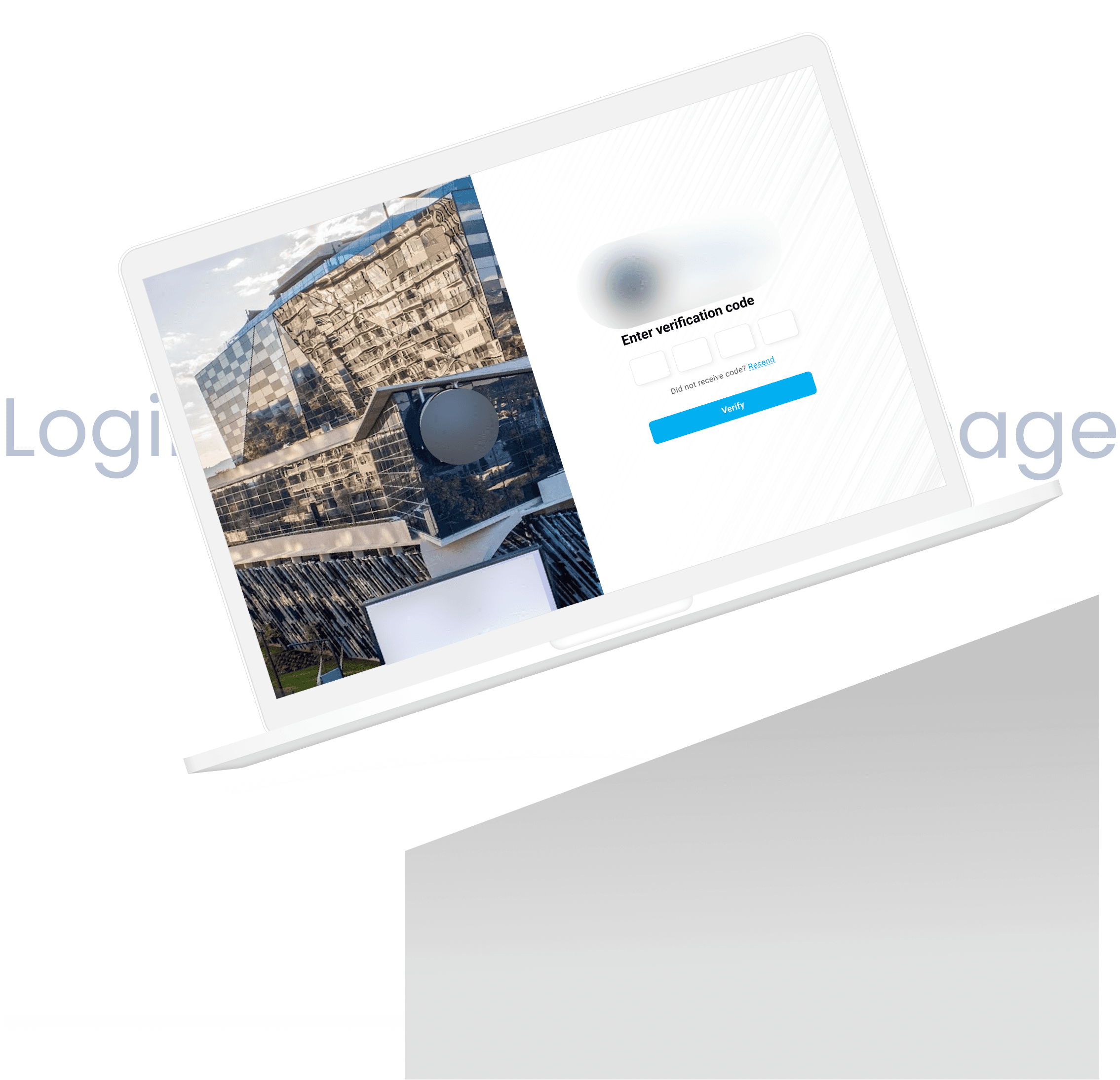
Login page

Thinking about the user flow

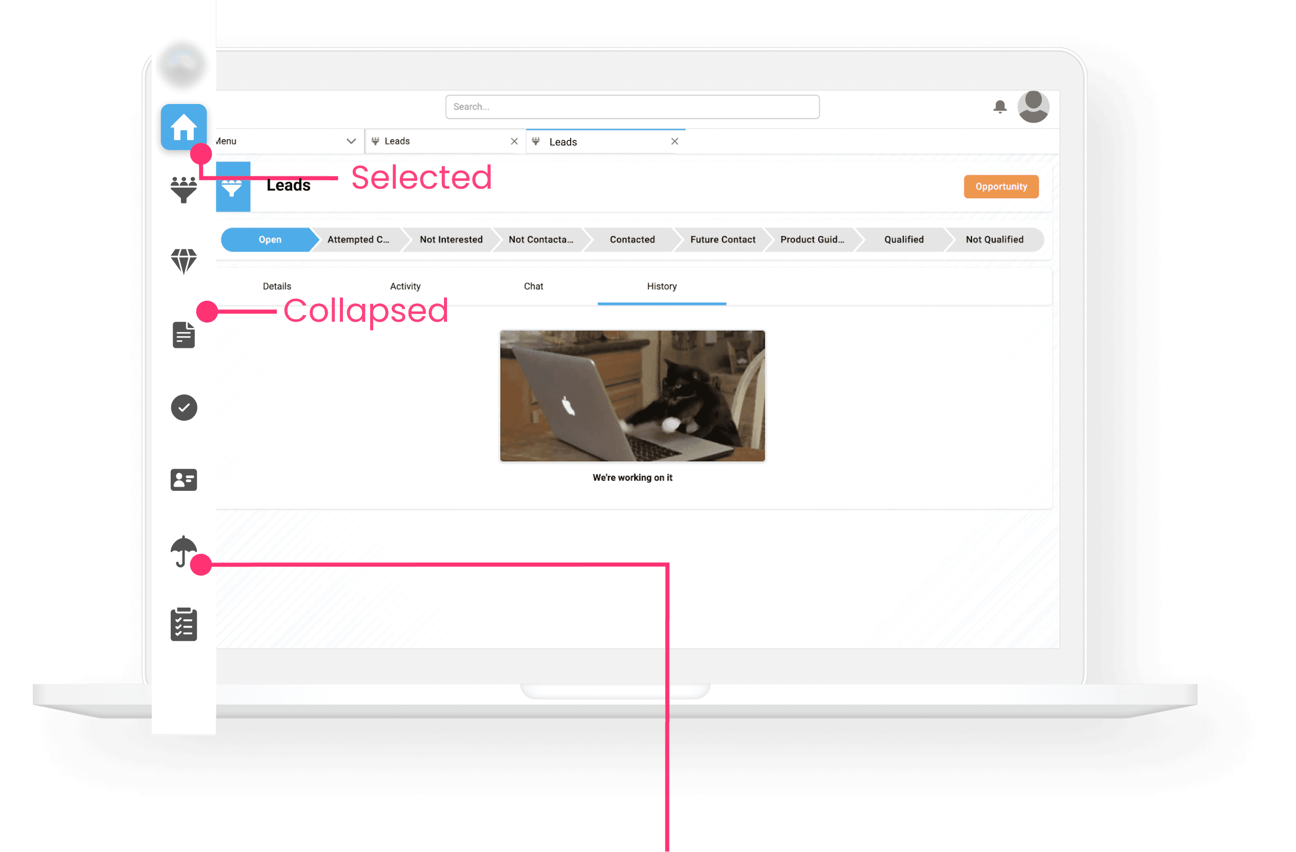
Navigation bar

The bad
Collapsed menu tucked away in tab
Difficult for users to see witch page they were on and require extra steps to navigate between pages.
Lack of visibility
After redesign
The good
Always visible
Clearly indicates current page user is on
Allows user to easily switch between pages just with one click
Adjusting navbar
The alignment of the side navigation bar was modified to dynamically fit our development team's dimensions. The change did not look as good as the UI design dimensions, s adjustments were made to ensure a visual appealing and functional layout
Mobile friendly design
To optimize the system for mobile use, we designed icons with sufficient space around them, ensuring touch targets are easily accessible and user-friendly. This approach enhances usability and interaction on mobile devices.

Static field

The change
Considering how fields would look with varying sizes, the updated look and feel ensures flexibility and consistency in the design, accommodating different layout needs.
This design change allows the static field to be used as a single component for developers with a cleaner interface.

Empty state graphics

In maintenance

Not found

No access

Broken

Upload files

No data

Files uploaded

No connection

No files
Design system
Colors

Icons

Editor toolbar component
Normal state

Selected state

Hover state

Dropdown menu

Wrap up
Currently, the system is still in development, with some users having access to a beta version for testing. There are many improvements and extensive testing to be done to refine the system. Our development team is actively working on various enhancements and tasks to ensure the system meets high standards before its official release. As we progress, the UI will be continuously created and improved to provide an optimal user experience.
