Market research
Competive analisis
Personas
Wireframes
High-fidelity UI
Prototype
Mini usability study
Accesibility evaluation
Work Cafe solution
This project ensure a seamless and enjoyable experience for remote workers seeking productive work environments in cafes. By combining elements of nature and food symbolism, the app fosters a calm and eco-friendly atmosphere, enhancing user engagement and satisfaction.

Category
Hospitality, food and drinks
Where?
South Africa, Johannesburg
When?
Nov 2023 - Jan 2024
What?
Native mobile App
Role
Designer, Researcher
Market Research
The problem
Professionals visiting work cafes face disruptions to their workflow as they wait in queues to place food orders, risking potential loss of seating. On workdays, challenges persist in efficiently placing large orders for other employees, leading to overall inefficiencies in the ordering process and hindering the seamless integration of work and dining in a cafe setting.
The claim
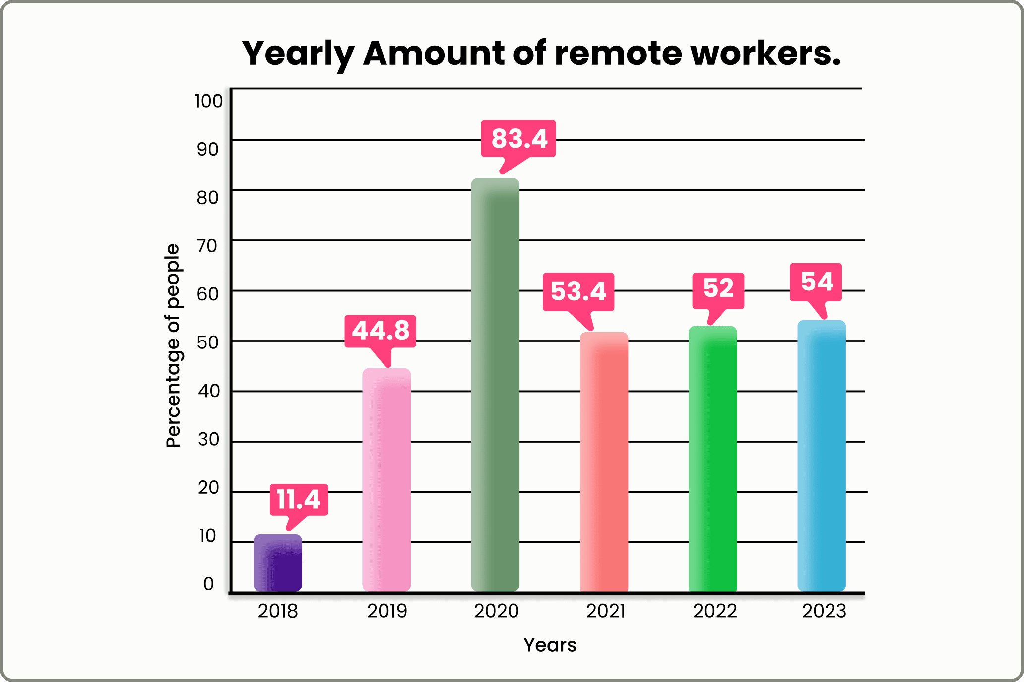
Since 2019 there has been a 20% increase in remote workers. Professionals are seeking environments where productivity meets pleasure in a unique workspace.
Competitive analysis
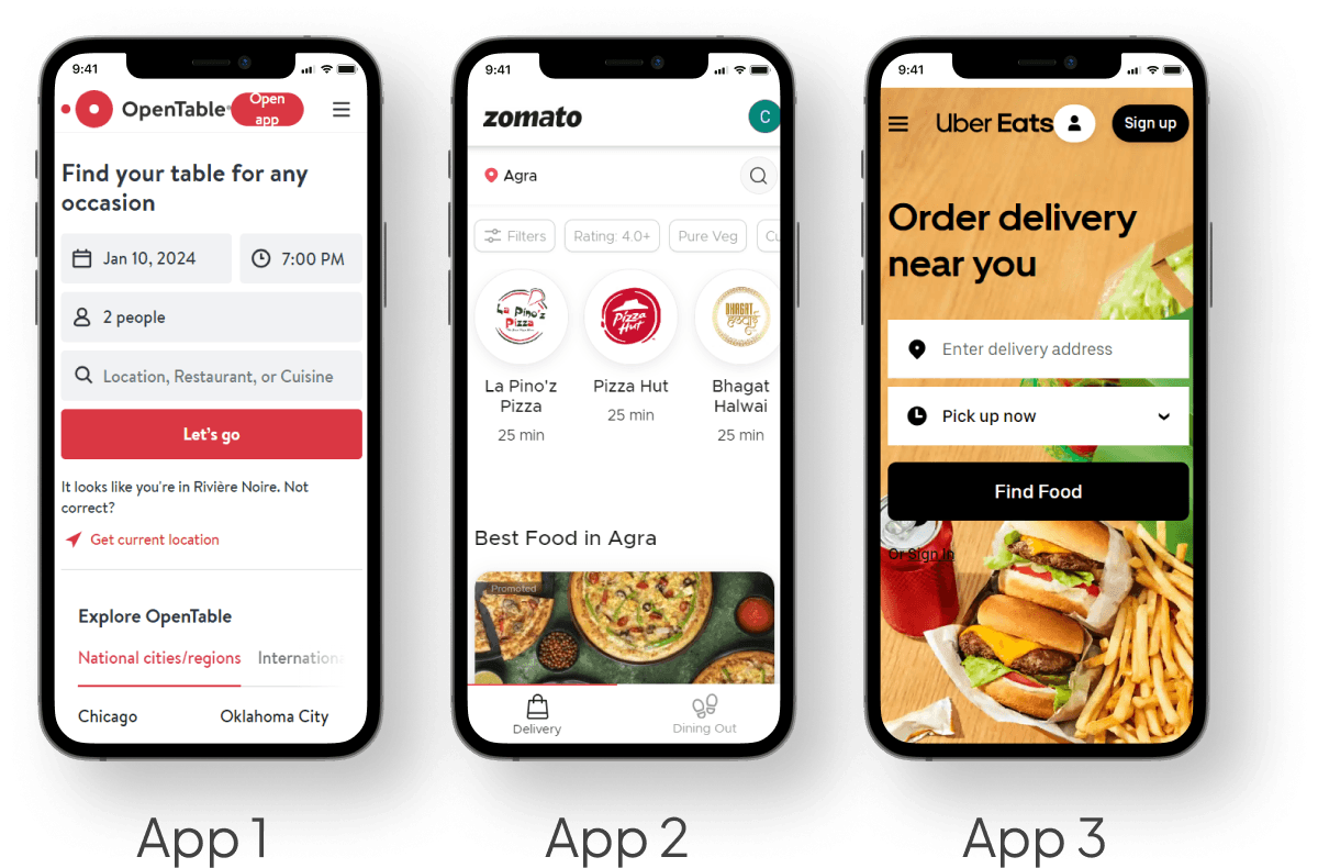
The Good
Good food description and pictures of the menu items.
Effortless reservation-making with clickable buttons, offering various time slots. Users can easily adjust the date, time, and guest count without the need for a phone call.
Valuable information about entertainment and facilities the restaurant offers (App 1 & 2)
The Bad
Only a certain amount of table reservations are available on the website with no flexibility (App 1 & 2).
Do not display available and peak times throughout the day.
No additional options to add food with table reservation (App 1 & 2).

Problem from comments


Persona's


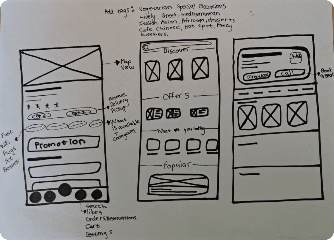
Paper wireframes
Once I established a flow diagram, I brainstormed a few ideas by using paper wireframes.


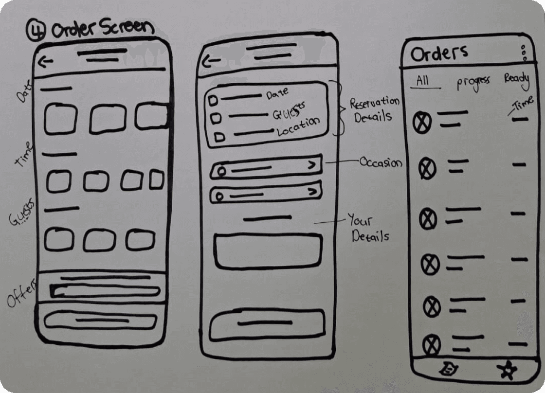
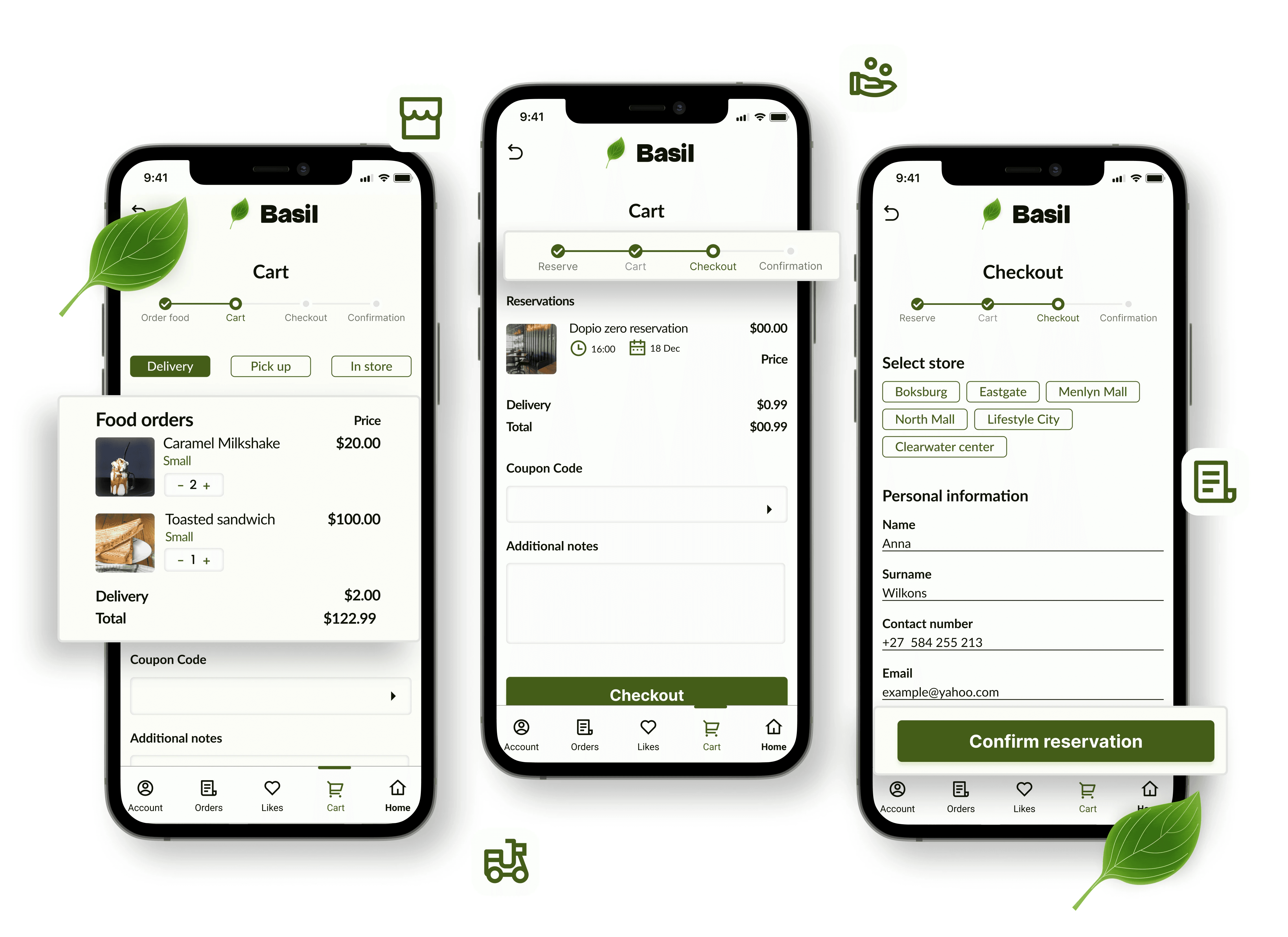
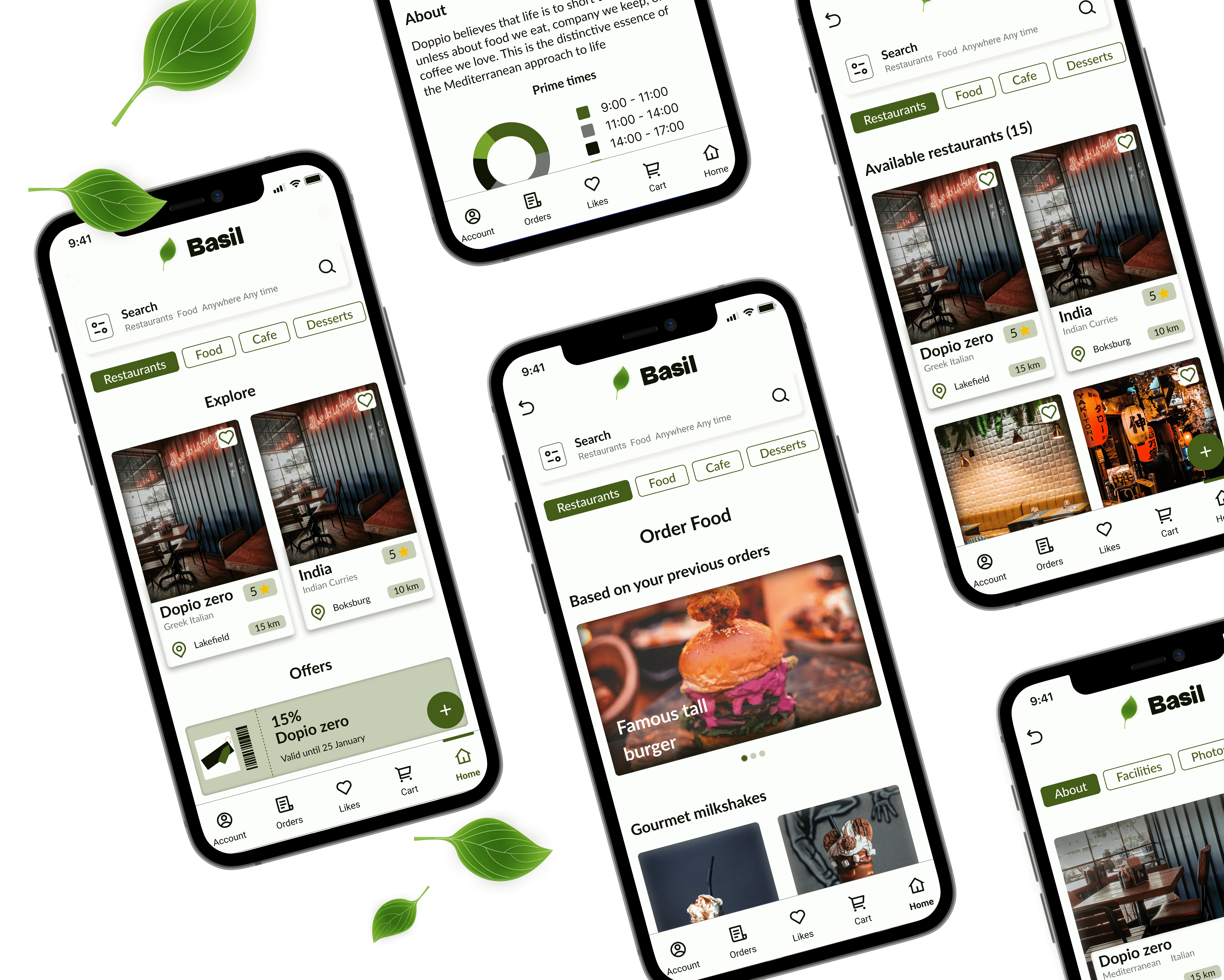
28 High fidelity-designs
Two different flows were created both had common goals of ordering food or making a reservation. While the goals were similar the difference was in the app structure. A filter and search button located in two different places complimented by a tab navigation bar was used for A/B testing.
High fidelity prototype
I connected the screens into a clickable prototype that will allow me to test the app on the first group of users.
Prototype validation
The users were tested in an informal setting in person. Each user was provided with specific tasks to complete within each flow. Following up on the user's interaction with the app, users were engaged in a discussion with follow-up questions to understand their experiences and preferences.
Alignment
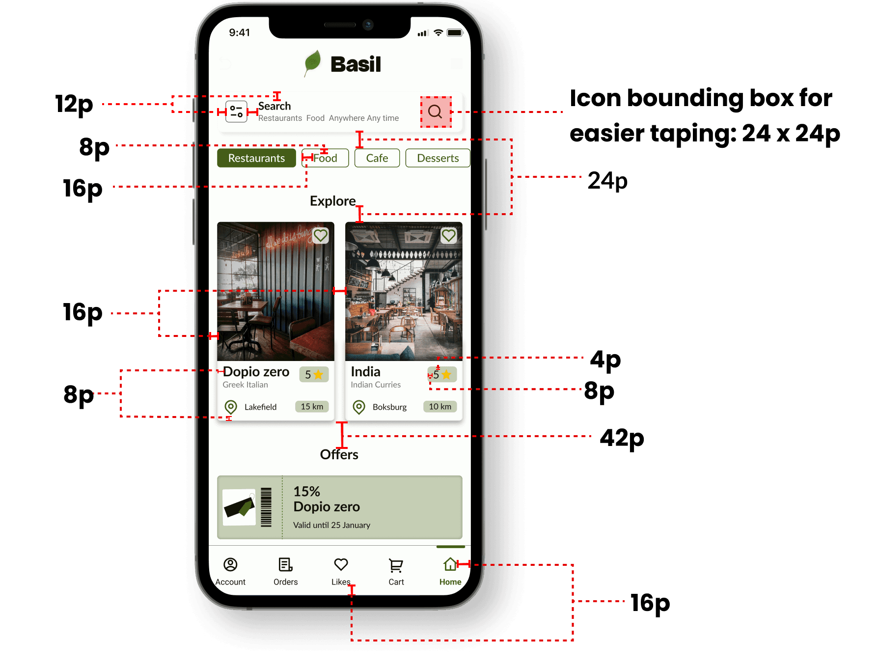
A 4-point grid was used with margins of 16 and 4, 8 and 12 within groups and 24 and 42 between groups.
Study results
Buttons tested

Pole results

2 out of 3 users were able to complete food orders and make reservations while one of the users struggled to find the ordering and reservation button.
Users were asked which button they found more clickable to help them order food and make reservations easier.
Prototype validation
From flow two 3 out of 3 users used the navigation bar to easily navigate through different types of restaurants and food.
None of the users were able to use the search bar on the bottom tab bar as well as the filter button in the pop-up menu.
2 Out of three of the users liked to see different facilities of restaurants before they made a booking.

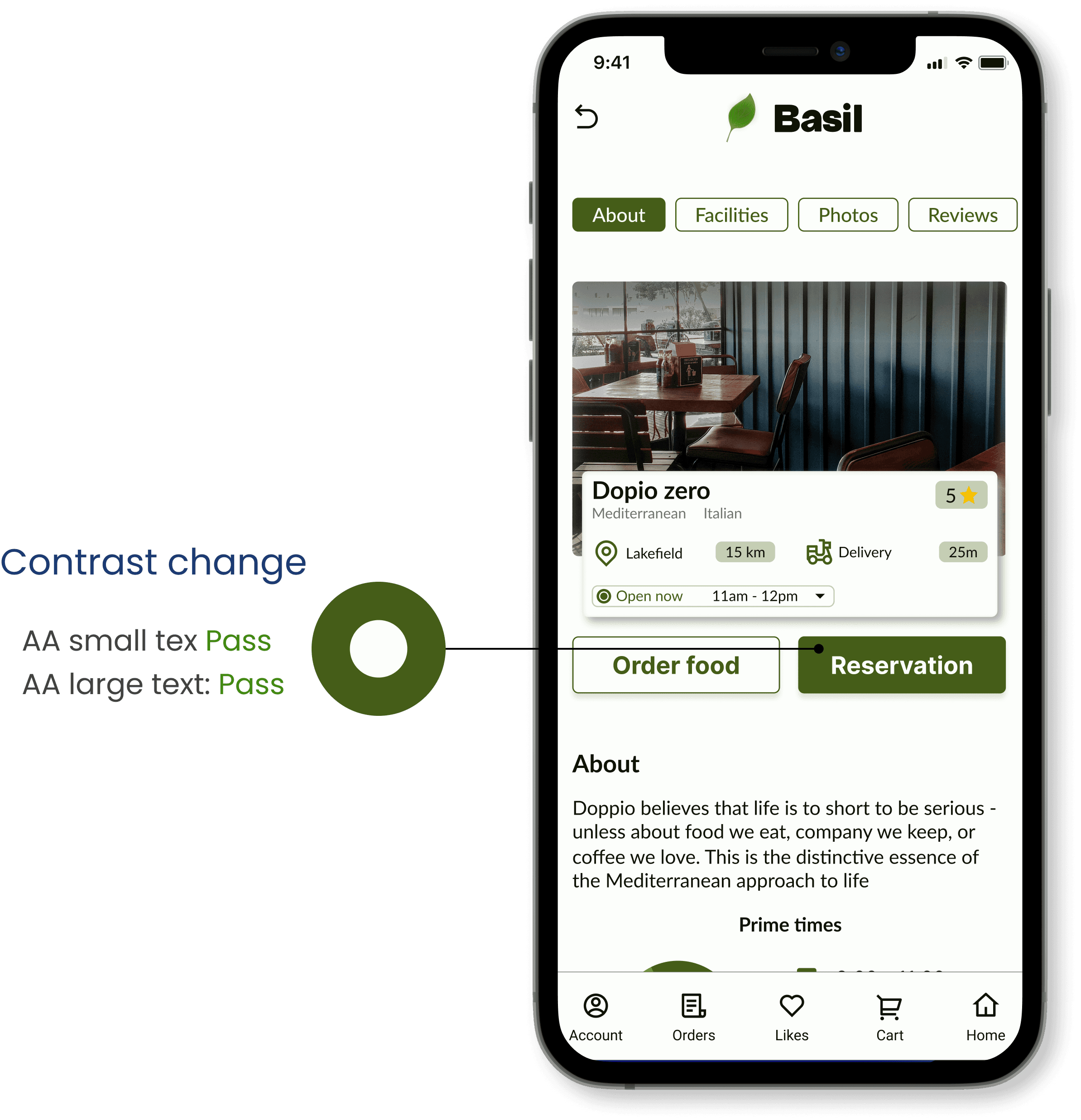
Accessibility check
Prototype validation
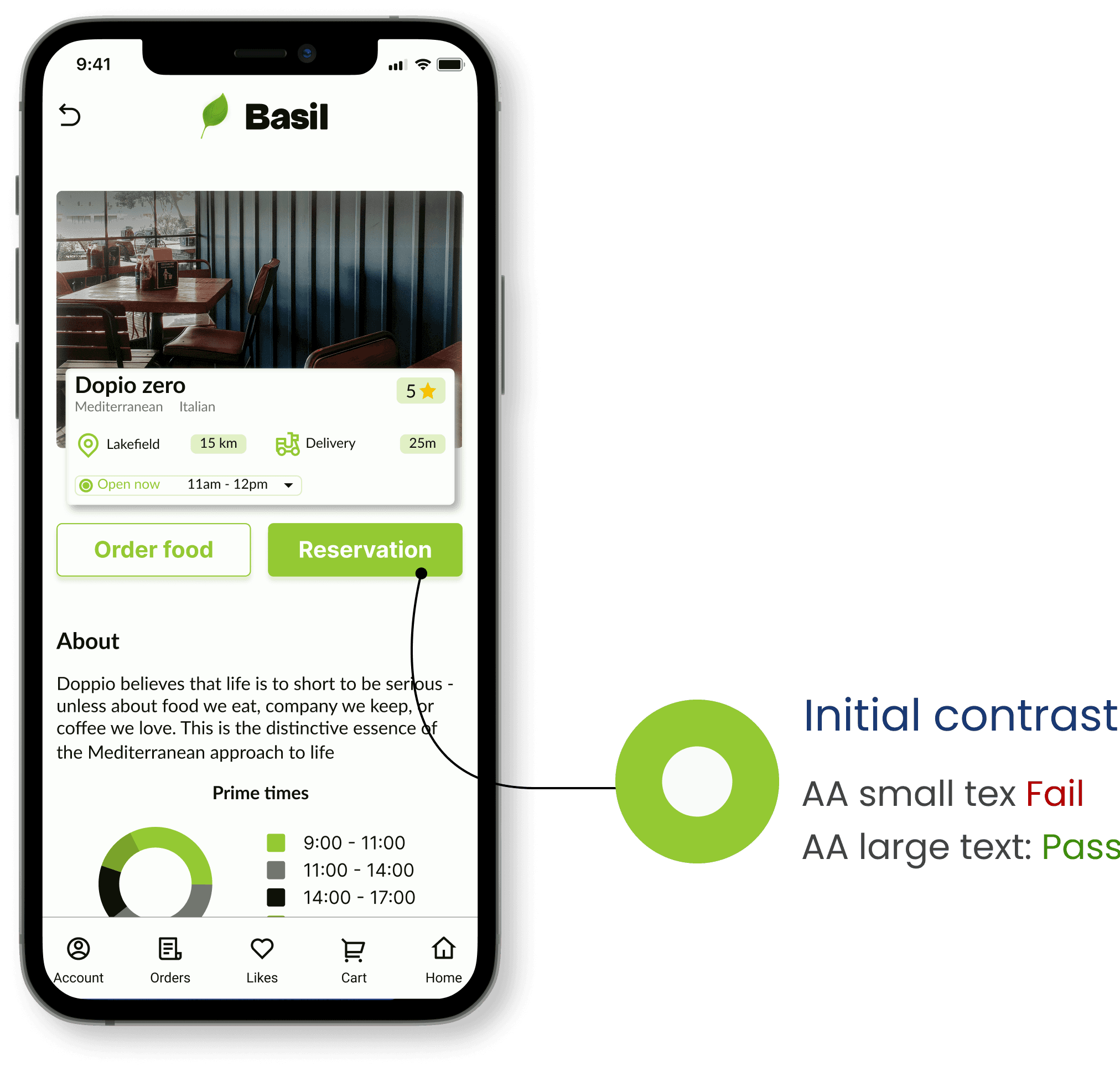
The app has been evaluated for contrast to match the AA standards of the WCAG. I used the WCAG to help me fix my mistake and change the colour.
One example is the call to action button. I wanted it to stand out from all the other elements but the colour I chose was not fully accessible. By decreasing the lightness of the colour the colour passed the AA standards.

Project summary
In conclusion, my design project progressed from wireframes to a visually appealing high-fidelity prototype. User testing revealed the efficacy of the nav bar. Emphasizing accessibility, adjustments commitment to inclusivity of the design.
The project merged aesthetics with functionality, prioritizing user satisfaction and setting the stage for ongoing improvement based on valuable user feedback.
View prototype